
How to Write the Perfect Master's of Design Thesis
A Part of a Series on Deep Dives into Stuff I've Obsessed Over and Nailed (IMHO)

There are a lot of ways to write a design thesis. But fewer how-to guides.
This one is mine.
I have spoken before about how writing has long been one of the central practices in my life; how writing is difficult, often maddening, but unequivocally the most essential ingredient to thinking clearly. This guide traverses that relationship as it plays out in the context of writing about design in an academic context.
*Important: this is a living document. Feedback is welcome, please leave comments!*
My perspective on design thesis writing comes from both sides of the table, as it were. I completed my own Master’s of Design thesis at TU Delft, where it earned me summa cum laude. Now, as a PhD student working within the Berkeley Institute for Design and the Co-Design Lab, I am a graduate student instructor in UC Berkeley’s Master’s of Design program.
In that role, I teach the Thesis Writing Studio and have worked closely with more than 50 students on composing their theses, some of which have gone on to be published in academic venues and receive awards, and others which, well, have received fewer accolades. All to say, I have seen both what works and what students struggle with, and thus, the aim of this guide is to gather instances of the latter as a way of supporting the former.
But I also wrote this how-to guide to help myself. Because writing is hard. Because even with multiple degrees, publications, and an uncountable number of written pages behind me, writing remains hard. Because as soon as I start to feel competent, the ambitious writer (neé thinker) within me demands more of my competence. And the easy-writing stretches, again, just out of reach. In that way, this guide is also a letter to myself: a way of making legible what I’ve learned (and what I’m still learning) about writing about design.
Ultimately, this guide is also for anyone interested in crafting strong academic design research, especially work intended for publication in venues like:
Association of Computing Machinery (ACM)
American Society of Mechanical Engineers (ASME)
Other Conferences
Other Journals
Design Studies, Elsevier
She Ji: The Journal of Design, Economics, and Innovation, Tongji University & Elsevier
Design Science, Cambridge University Press
Design Issues, MIT Press
Journal of Design Research, Inderscience Publishers
Lastly, because a Berkeley MDes thesis sits in that unique overlap between scholarly document and (personal) artistic artifact, the lessons here generalize anywhere you’re trying to communicate about design in a theoretically and procedurally situated way.
The Three-by-Three Matrix
Before we get to what makes writing a design thesis hard (and how to do it anyway) we need a shared understanding of what a strong thesis is meant to do.
Based on the MDes thesis expectations at Berkeley, I’ve found it helpful to frame this through a three-by-three matrix that comprises:
The three goals your thesis must accomplish.
The three modes of knowledge you must show fluency in.
While not every thesis balances these equally, the strongest ones touch all nine cells in the grid.
The Three Goals of a Berkeley MDes Thesis:
“Take a critical position in the literature.”
Your thesis should intervene in an existing conversation in the design literature. That means reading and linking back deeply, not just broadly, across the literature and taking a stance thereon. You’re not summarizing existing work; you’re showing how your thinking, at the very least, builds upon it, and ideally, also reshapes or redirects it.
“Engage stakeholders thoughtfully.”
Your thesis should be grounded in our world, a world that is shaped by the people, systems, or conditions it hopes to impact. That engagement should be meaningful, not performative. (More on that below.)
“Craft an exquisitely considered artifact.”
Whether the final output is a system, a service, a product, a provocation, or even the thesis document itself, it should reflect the care, learning, and design sensitivity of the process that led to it.
The Three Modes of Knowledge:
Theory
You need to demonstrate that you can think with and through design theory. This is a research degree at a top-tier R1 institution, which means your thesis must be situated intellectually, not just practically.
Method
You should be able to articulate how you learned what you learned: through interviews, prototypes, workshops, cultural probes, whatever tools and practices you used. And, you must be able to articulate and document why you used these methods and not others.
Technology
This might mean literal technologies (like software, fabrication methods, or interfaces) but it can also mean the material logics or infrastructures that your work engages or critiques. Every thesis is embedded in some technical or systemic context. Name it. Work with it. Show that you understand what it affords and what it constrains.

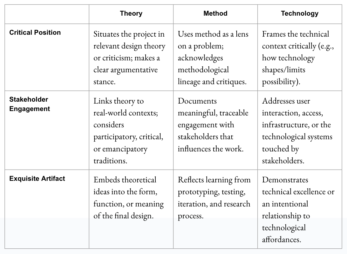
This matrix isn’t a rubric, exactly, but it is a map. If you feel lost in your writing, come back to these nine squares and ask: which ones am I inhabiting? Which ones am I avoiding? Which ones need more care?
The rest of this guide is about how to build a thesis that lives across this full grid. But first, let’s talk about what tends to go wrong and why.
What Makes Design Thesis Writing Hard (and Why That’s Not Just About Writing)
The most infuriating part (though I promise, in time, it also can become the most delicious part) about writing is that, in design work, it happens in tandem with the doing. Writing and doing are not diametrically-opposed, separate-acts, and they are certainly not sequential.
Even though it might feel comforting to imagine that you can just do the work and then write it up, that’s not how design research works. And you, writing a thesis for a Master’s program at an R1 university, are being asked to do something harder. You must write to think, and think through doing. It’s in the back-and-forth where clarity emerges.
But that movement is cognitively demanding. Especially if you’re a monotropic thinker, i.e., someone who enters flow states most easily when immersed in one mode or topic of work. Maybe you find your flow in coding, or fabrication, or speculative ideation, wonderful, that’s part of what draws people to design: the joy of finding yourself inside a particular kind of making.
But flow is not the whole job.
Academic design asks you to move (again and again) between different modes of knowing and making. Between doing and naming. Between situated messiness and abstract synthesis. That movement is uncomfortable. And it’s unavoidable. And you must write the whole way through, that’s what makes design ‘practice’ different from design ‘research.’
What’s tricky is that writing about design doesn’t just reflect your work, it reveals how you’ve done it.
Many of the things students struggle to articulate in their theses are the very same things they’ve struggled to enact. The problem isn’t just that the writing is hard. It’s that the doing was uneven, or unexamined, or difficult to tolerate. And the writing surfaces that.
So, before we dive into what each section of your thesis needs to include, I want to name some of the real struggles that show up again and again. Not just on the page, but in the practice. These are five patterns I’ve seen across more than fifty MDes theses:
1. Design Fixation: Rushing Toward the Exquisite Artifact
It’s understandable that you want your final piece to be beautiful, ambitious, and satisfying. And for many of you, that’s where flow lives: in (the imagining of the) making. But when the artifact becomes the gravitational center of your thesis too early, everything else starts to orbit it. The questions get blurry. The research flattens. You skip steps because you’re designing toward a solution, not through a process. Academic design work doesn’t reward perfection, it rewards rigor. Your outcome should be exquisite because of what you learned, not in spite of what you ignored.
2. Situating the Work in the “Disciplinary Lineage”
Many students confuse “having a domain” with “being in dialogue with the literature.” But writing a design thesis means entering a lineage of thought, not just a topic area. If you’re working on museums (setting/domain), you’re not just writing about museums, you’re intervening in experience design, cultural criticism, or speculative futures, depending on your frame (disciplinary lineage). You need to locate your work in a discipline, not just a setting/domain. This is what lets readers understand how to take your work seriously, and what kind of contribution you’re aiming to make.
3. Background ≠ Setting/Domain Dump
Relatedly, the Background section is not a Wikipedia page for your setting/domain. It’s not the place to tell us what a museum is, or that climate change is real. That kind of setting/domain context belongs in your Introduction. The Background is where you show us who else has worked in this space (designers, researchers, theorists) and what their work makes possible or impossible. Think of it as a lens you hand your reader: “Here’s how I want you to look at what follows.” That lens should come from design literature, not just real-world facts.
4. Stakeholder Engagement is Not Just a Checkbox
Stakeholder engagement is not a box to tick, it’s a foundational method. And yet, students often skip it, rush it, or under-report it. You need to show who you talked to, why you chose them, how you engaged them, and what changed as a result. Did your questions shift? Did your design direction evolve? Stakeholder work is a living part of your research, it deserves evidence and attention, not just a quick sentence and a shrug.
5. Process Documentation: Tell Us Exactly What You Did
Writing about methods isn’t glamorous, but it’s necessary. Students describe what they did at a high level (“we prototyped several versions”), but never show us how they got from one moment to the next. What prompted iteration? What failed? What surprised you? What did you make between the prototypes? If someone else were to follow your steps, what would they do first? What materials would they need? Without process documentation, your outcome reads as magic. Show us the work.
If you say you “talked to participants,” that’s not a method. How many? For how long? What were you looking for? What did you learn? If you did “iterative prototyping,” describe what changed across iterations and why. The burden of proof is on you, not your reader. A well-articulated method invites trust. A vague one invites suspicion. The best theses make you feel, as a reader, that you could do it too.
How to Write Each Section
Now we’re going to go through each of the sections.
Think of this part as a tour through the architecture of your thesis. Each section has a job to do. And while many students want to start with the “juicy” parts (i.e., showing off the outcome) your writing has to do more than describe. It has to structure your reader’s attention and your conceptual aims. It has to build clarity.
Below is a description of what each section is for, what I’ve seen go wrong, and what makes it work.
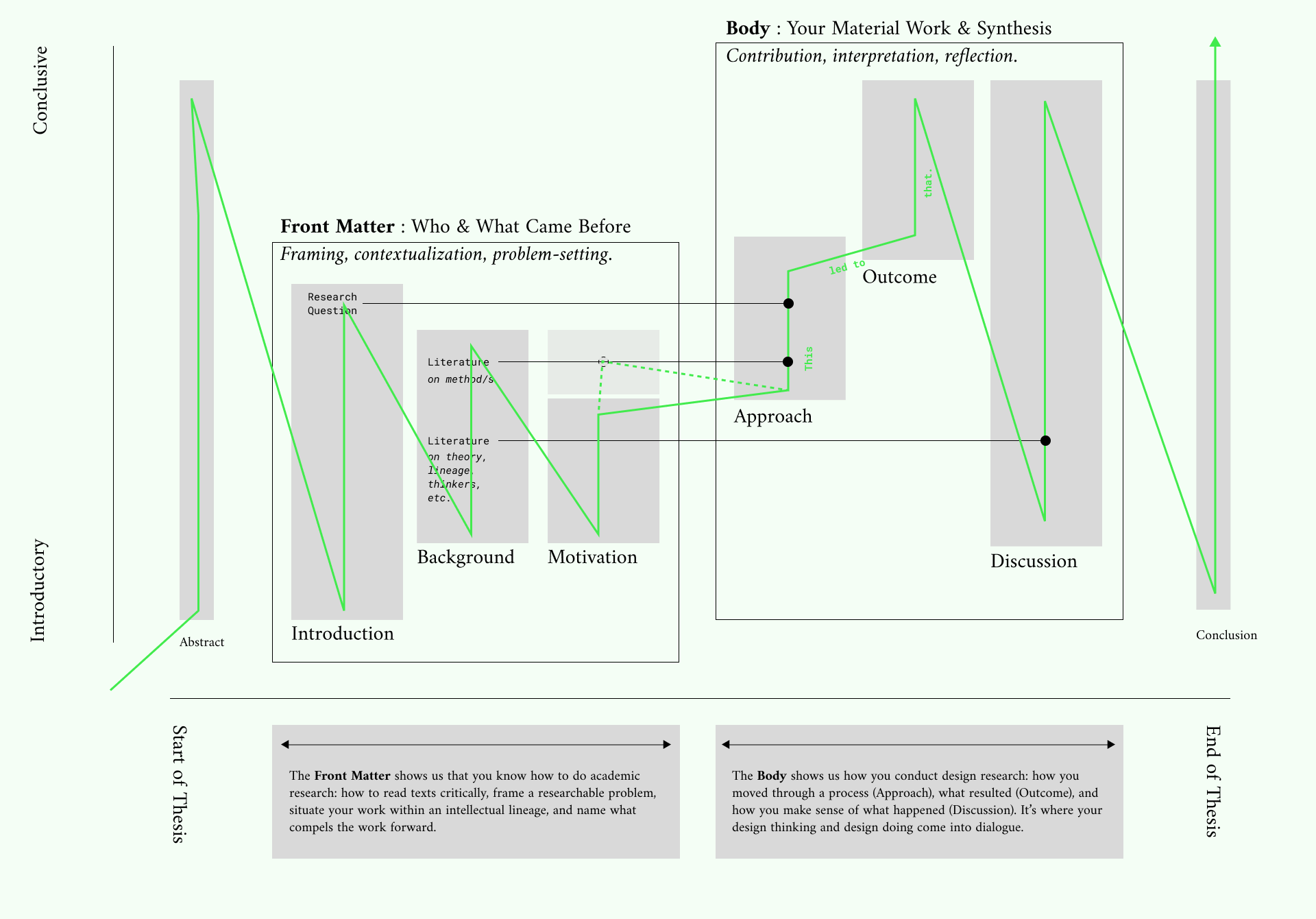
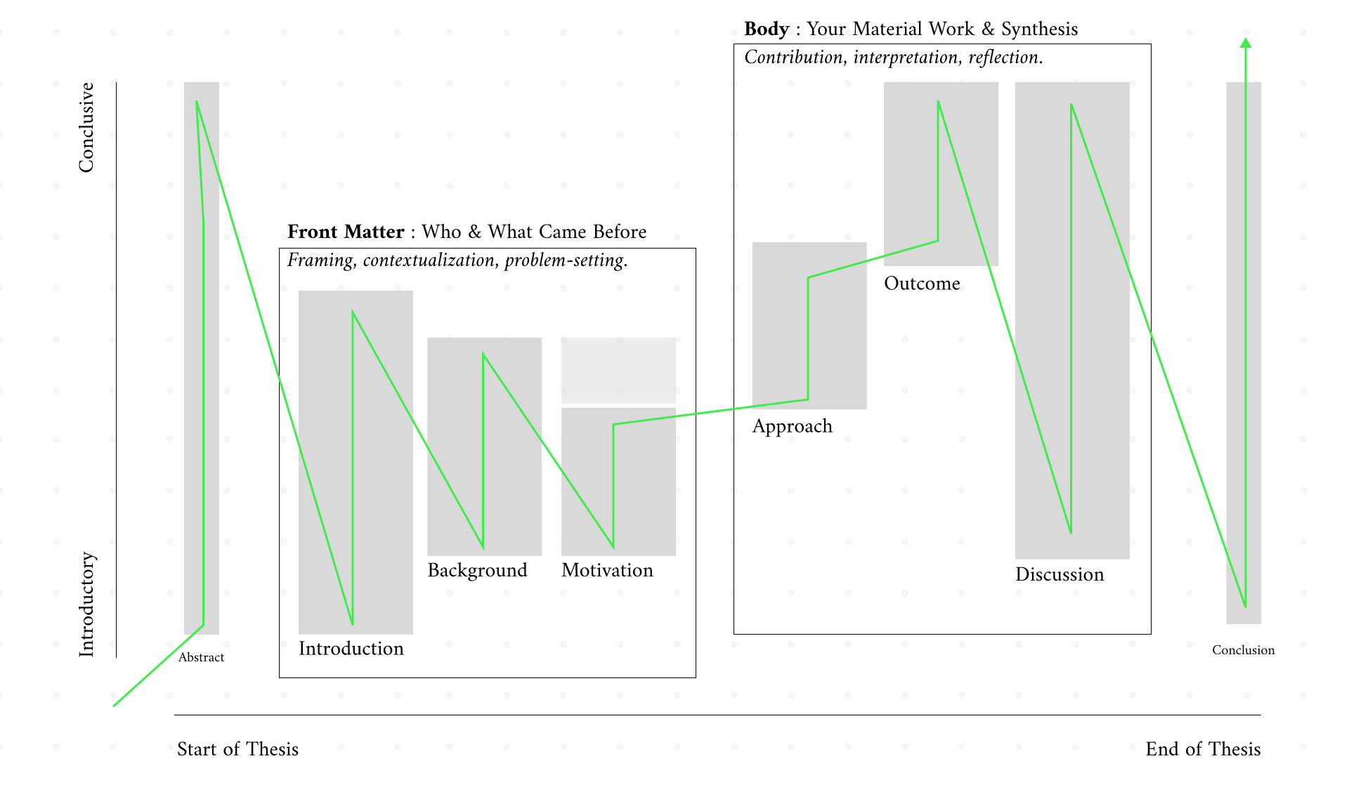
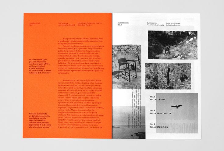
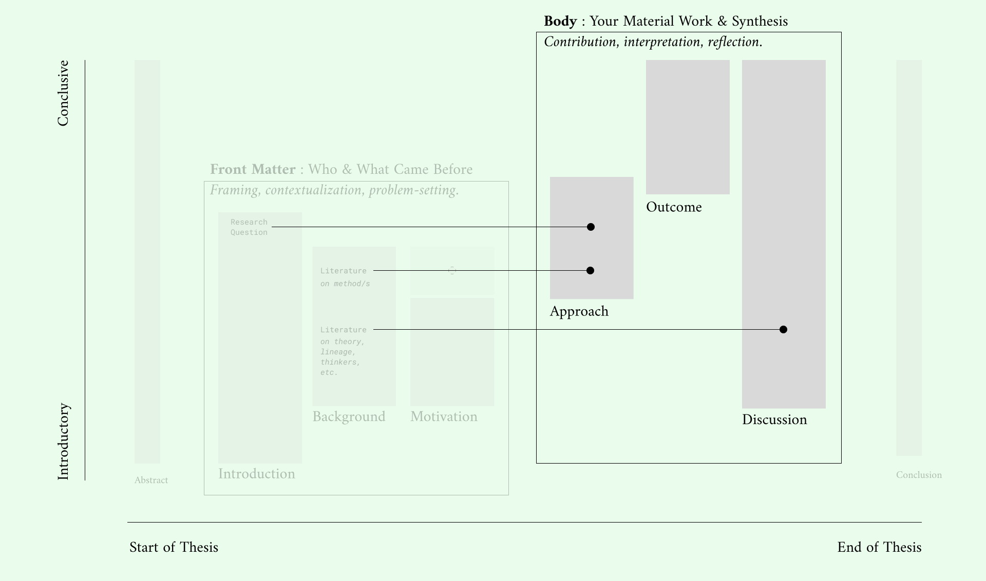
FRONT MATTER
In the Berkeley Master’s of Design program, your thesis begins with three distinct sections: Introduction, Background, and Motivation. Not all venues separate these quite so cleanly, you may find them collapsed into a single section with subheadings, or even blended together entirely in other disciplines or institutions.
But at Berkeley, we separate them on purpose.
The structure is pedagogical: it teaches you to recognize how these types of content (domain context, disciplinary lineage, and research urgency) do different work. As you become a more seasoned researcher, you may choose to blur or reorganize these boundaries. But for now, learning to treat them as discrete will sharpen your thinking and clarify your writing.
Here’s what each section does, what I’ve seen students get wrong, and what belongs where.
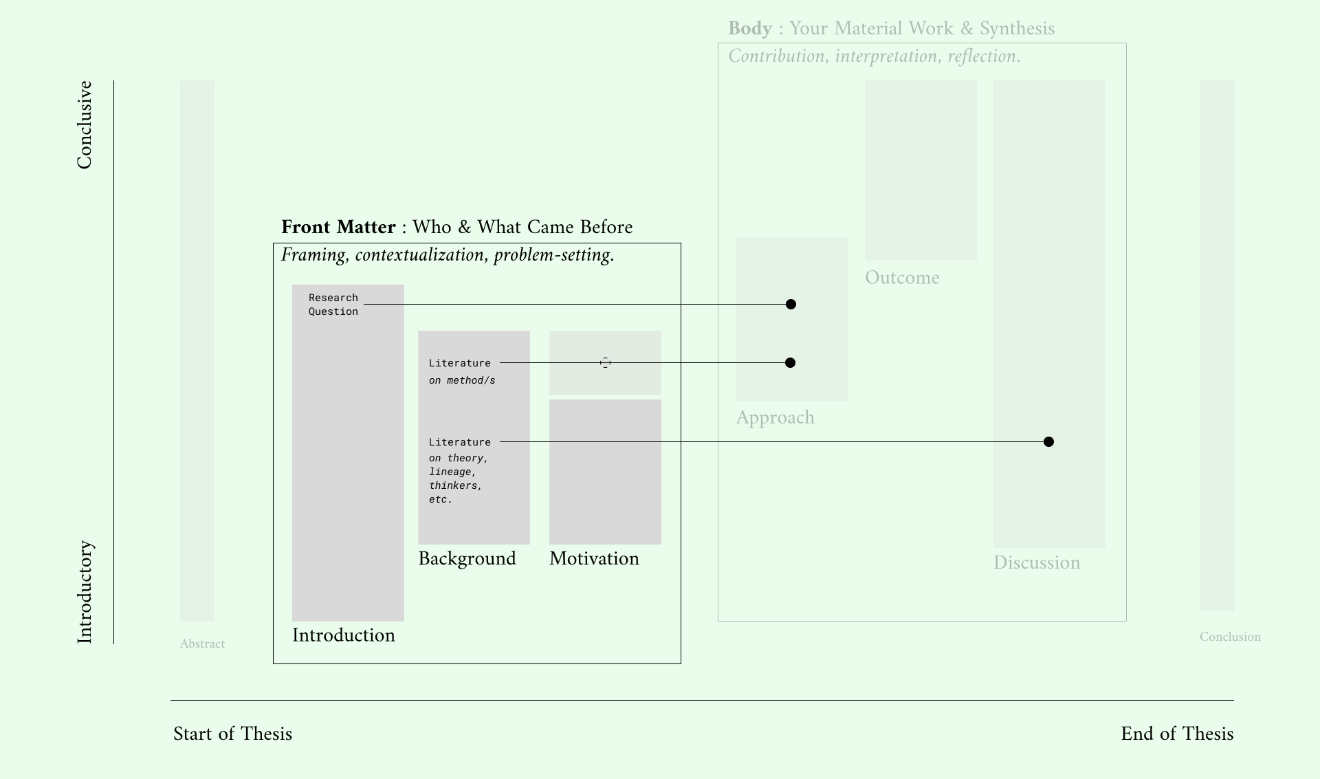
Front Matter: Introduction
There are three things the Introduction needs to do:
Introduce your domain, i.e., the world you’re working within. If your project is about museums, this is where you tell us what kind of museums, what they’re doing in the world, and why they matter.
Surface the problem you’re addressing. What’s not working? What gap or tension are you intervening in?
Set the scope of your work. What is your Research Question (yes, you need a research question)? What are you taking on? What are you not trying to solve?
In other words, the Introduction is a TLDR without findings.
This is also the place where students often confuse domain and discipline. If you’re writing about museums, it’s tempting to go long on institutional history and somehow students end up doing that in Background, but that is actually domain context, and it belongs right here in the Introduction.
Front Matter: Background
The Background section is where you show us your disciplinary lineage. It’s not about the real-world facts of your domain, or about the one or two or three papers that directly support your idea. Rather, it’s about who you are in active conversation with in the design literature and sometimes also the academic literature beyond (critical theory, psychology, sociology, etc.).
What designers, theorists, or researchers have taken on questions like yours? Whose shoulders are you standing on? Are you extending work in critical design? Participatory design? Systems thinking? Show us.
I often use this metaphor: imagine your thesis is a house on a hill, with windows on every side. The Background effectively says, “Yes, there are many windows to see the view from, but this work only wants you to look out of this window.” It shapes our perspective and tells us what kind of design work this is.
This section is also not meant to be comprehensive. It’s not a literature review in the traditional sense. It’s curated. You’re making an argument through what you include and what you don’t.
Importantly the Background is also where you should cite the approach you plan to use. You’ll describe the method in more detail later, but this is where you name it, ground it in precedent, and give us a sense of why you’ve chosen it. This rationale belongs here because methodology isn’t random, it co-defines your problem space (two thesis might look through the same window, but one might use Method A while the other might use Method B). The Background is where you set that frame, and help the reader understand not only what you’re studying, but how and why you’re choosing to study it that way.
Front Matter: Motivation
The Motivation section connects the domain and the discipline, and sometimes your own personal reasons for doing the work. It answers the big questions: Why this? Why now?
This is where you build urgency. Maybe you’re responding to an emerging technological shift, or a persistent social problem, or a lack of critical framing in your field. Maybe you’re picking up a thread from your own life or identity. Regardless, this section tells us what makes your work timely, necessary, or resonant.
It’s also a place to reference precedent work (if that work genuinely shaped your desire to explore this area. For example, maybe you’re designing a participatory toolkit for museum visitors because you’ve seen powerful engagement strategies succeed in other cultural institutions, but you’ve noticed their absence in museums. If that’s your motivation, say so. Show us why museums are the right site for this intervention, and what you hope such a toolkit might shift.
BODY
In the Berkeley Master’s of Design program, the second half of your thesis (Body) houses the most tangible parts of your research: Approach, Outcome, and Discussion.
These sections are where we see what you did, what came of it, and how you make sense of it all.
Each one builds on the last, but they’re not interchangeable. Together, they form the arc of your contribution: the design research you conducted, the artifact or system that resulted, and the insights or arguments you’re now able to make because of it.
We separate these sections deliberately.
The structure is pedagogical: it teaches you to differentiate between the doing (Approach), the result (Outcome), and the meaning-making (Discussion). In real design work, these often unfold iteratively and in dialogue. But in thesis writing, they must be presented clearly, so your reader can follow how each phase sets the stage for the next.
As you gain more experience as a design researcher, you may begin to blur or remix these boundaries. But for now, treating them as distinct will help you sharpen your documentation, clarify your logic, and develop a strong voice in your writing.
Body: Approach
The Approach section is where you show us how you arrived at your final solution. Not just what you did, but how each step informed the next.
Some successful ways I’ve seen this handled include breaking it down into prototyping phases or thematic pivots. A strong design journal can be a huge asset here, especially if it lets you trace your movement between desk research and in-situ work, and then back again.
You could even create a diagrammatic map of your process. Anything that makes your choices legible.
That said, I’ve seen students struggle here more than anywhere else.
A metaphor I often use comes from my own elementary school English class. (And apparently its now used to teach Computer Science at Harvard.) It goes like this: imagine you are teaching someone to make a peanut butter and jelly sandwich with words alone. If you write, “spread the peanut butter,” but don’t say with what or on what, someone might end up spreading it on the counter with their bare hands. What the exercise teaches you is that, understandably, we make many shortcuts in language because we correctly assume competence, but your reader could pick up your document in ten years with no knowledge of an MDes, for them to make the leaps you are intending for them to, you have to be precise. Your aim is to support someone reasonably follow your thinking well enough to replicate your approach without ever speaking to you.
What belongs here: the full arc of the process that led to your final artifact. That includes early research, design pivots, rough prototypes, failed ideas, and the moments where feedback or reflection reshaped the path forward. If you tested three different versions with users and learned something each time, those findings belong here.
Outcome is where we’ll meet your final design. Approach is where you show us how you made the sandwich, as it were.
Body: Outcome
This section is also where your discernment matters most. You are the best authority on what counts as the “final artifact” (Outcome), and what belongs to the process that led you there (Approach). Maybe your project moved through ten iterations, and you made a judgment about what you wanted to put in front of people for that final round of testing. That final version, and what you learned from it, belongs here in the Outcome.
What you include in Outcome should be:
The final artifact (or system, tool, provocation, etc.)
The final user/stakeholder engagement with that artifact
What you learned from that final moment of evaluation or reflection
Earlier tests, design pivots, failures, and formative feedback? That’s Approach. The final test, and the insights it yielded? That’s Outcome.
And yes, please show us the evidence. Include photos, sketches, screenshots. Append interview questions or testing protocols. Make the final round of learning feel visible and credible. This is the moment when we get to meet your design and understand how it behaved/ was received in the world.
Body: Discussion
The Discussion section is where you make meaning. Not just reporting on what happened, but reflecting on its implications.
This is where you synthesize what you learned across the approach and outcome. What design principles emerged from your process? What tensions remain unresolved? What are the theoretical stakes of what you found?
It’s also a place to re-situate your work within the broader literature introduced in the Front Matter. Earlier in the thesis, you showed us what conversations your work was entering. Now, you have something to say back. How does your project extend, challenge, or complicate the work of others? Where does your contribution land within those traditions or debates?
Your voice matters here. Not just the voice of your participants, not just your citations…but yours. This is where you surface your interpretive thinking and place your work in the broader discourse. What should we take from what you did? What should designers or researchers do differently because of your thesis?
Abstract
Your (extended) abstract should be like a mini version of the entire paper. One to two sentences that describe each of the core sections: Introduction, Background, Motivation, Approach, Outcome, and Discussion.
If someone in your life were to only read this one page, they should be able to reasonably act as if they knew what was in the rest of the document, and could hold a curious, informed conversation with you about your thesis project.
Conclusion
Your Conclusion is where you bring the thesis full circle. It’s not just a summary of what you did, rather, it’s a moment to step back, synthesize what it all added up to, and signal what that work contributes to design as a field. A good Conclusion often includes:
A re-statement of your original problem or research question. What did you set out to explore or investigate?
A synthesis of what you found or learned. Not a list, not a repeat of your Outcome section, but a concise articulation of the key insights, principles, or patterns that emerged from your work.
A reflection on what changed…In your understanding, in the design direction, in your sense of the problem, what evolved?
A statement of contribution. What does your thesis offer to other designers, researchers, or stakeholders? What might someone take from your work?
A sense of what remains unresolved or open-ended (i.e., future work). What are you choosing not to answer? What questions are still worth exploring? What do you hope others might take on?
The best Conclusions read like someone who’s gained perspective. You’re not in the weeds anymore. You’re telling us what the work did, not just what you did. That’s the difference.
References
Your references need to be in IEEE format. Even if you use visual or inline citations (which some graphic designers like to do), you still need a formal reference list at the end.
And a note on in-text citations: don’t just slap a name and date at the end of a sentence. Build the citation into your prose. Mention the author. Give a little context. Especially when citing canonical work, this helps the reader understand its place in your argument and improves the flow of your writing.
With that, happy engineering-design-researching,